AT ZERO REMOVE:
A
Conversation with Cameron Armstrong
Stephanie
Buhmann
March, 2009
Best known for his use of exotic metal finishes, economical and yet expressively rich, Cameron Armstrong creates dramatic yet unpretentious buildings clad in varieties of aluminum-coated steel panels. Conveying a strong sculptural aesthetic, these buildings can be found across America, in locations ranging from dense urban environments to vast landscapes little altered by human hands. The key to understanding his work is in grasping where it starts: for Armstrong, design begins with the possibility of bringing form directly from a deep engagement with present conditions. His clients experience the fusing of their lives and hopes with the light, the landscape and the climates of their building sites as these things together form the ground for new architecture.
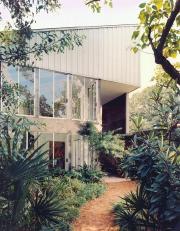
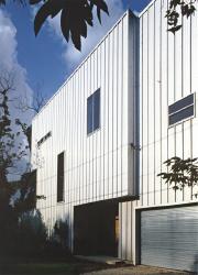
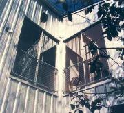
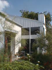
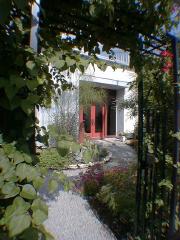
In Houston’s diverse and art-oriented West End enclave, more than a half dozen of Armstrong’s houses add intriguing textures to the urban landscape. Built between 1993 and 1998, they vividly demonstrate his signature style, characterized by angular geometries, recurring banks of inset glass, and crisp ribbed panels of coated steel. They reveal an exceptional handling of light, employed not only as illuminating source, but as a means for shaping space via stark visual contrasts. The visual interactions born of each day's unique interplay between light, weather, and the buildings' austere geometries both animate and complete their designs.
The following exchange delves deeper into Armstrong's thought, and how it shapes his work...
Stephanie Buhmann: I'd like to start with a question about how you came to practice architecture. As with an artist, your interests stretch well beyond symbols and composition, and how things are constructed in a literal sense -- yet you are an architect, not an artist. It's not obvious to me why you would have turned to architecture instead of another art medium, such as sculpture for example.
Cameron Armstrong: Even at a young age, I was fascinated by time and history, and aging buildings seemed their emblem. As a child in London, I lived in what seemed quite an old building, and I wondered why that structure had survived, and not others. I also learned about deep time, the epochs of the Earth, due to my father's work in oil exploration. Geology seemed to offer solid answers to why the world looks and feels as it does, and the enormity of its time-scale was interesting in itself, so as a young man I studied and practised it for several years. But eventually I felt unsatisfied, and changed course: I registered at the Institute for Architecture and Urban Studies to explore working at human scale. I found IAUS very exciting, with smart young instructors and big ideas. Plus, life in New York was no less adventurous than prospecting for minerals in the far north. Architecture thrilled me with the chance to make things that have historical presence in human terms. After so much time studying the Jurassic, the world of design felt very intimate. So, I didn't start with a talent for seeing or making things, and then focus on a particular medium. I had a number of basic impulses, longstanding involvements, which architecture served to channel.
Stephanie Buhmann: So the study of architecture dovetailed with your personal pursuits. But buildings exist for objective reasons, of their owners and society, which are often quite basic. How do you reconcile your interests with these other purposes -- of producing shelter, economic value, and symbols, for instance? You've described how your work looks to discussions with the client for clues to the essential "gesture" of their building. What's the connection? Can you describe how this dialogue motivates or shapes your work?
Cameron
Armstrong:
Finding out what moves a project puts the designer squarely in the client's
present reality. It's a very intimate and immediate place, a field of
decisions. Certainly, being there satisfies a personal need to mark time
and project ideas, but in a way it also defines professional service:
occupying and developing that space is what an architect does. My projects
begin with the clients' desire for big, objective change: it's a constant
theme. They don't want to do small things. It's almost always a matter
of changing everything, all at once. Fundamentally. But because this new
existence is undefined, its physical form isn't obvious either. I enter
this reality at the level of its frustrations and hopes, and try to figure
out the critical direction, the gesture the work needs to accomplish.
To begin, we simply ask a lot of questions, to shed light on why the present
doesn't work, and what the future should be like. Success depends on clear,
open communication, as in a good conversation. It's impossible to separate
the shape of the new building from the shape of the conversation that
generates it.
Stephanie Buhmann:
It seems from this that you intend for your process - rely upon it even
- to discover some essence that is somehow written in your clients’
lives. You want to discover it, and turn it into a building. This is not
simply just making a change, I think.
Cameron Armstrong: Traditionally, there's been only an arbitrary link between the physical changes brought by new buildings, and what the users might truly need or desire. I think that even as late as the 1990's, most designers still saw "programming" as a superficial nod to key requirements, rather than as the basis for design. A project's success turned on the accident of whether the architect's vision was aligned with the client's interests. But things are different now. For one thing, visionary-ness in architecture is out of fashion. And with input from new technologies and the social sciences, we're much better able to reach deeply into the client requirements, and base buildings directly on them. The goal is for the changes brought about by the building to embody, and directly express what is moving the client. So, yes, we start with an agenda of change, but it often ends in transformation.
Stephanie Buhmann: Your dialog with the clients is not directed by aesthetic longings? Not by "vision" in that sense? That's surprising to hear from a designer. The idea of finding the solution to desire through research into the clients themselves implies a lot of trust on their part, to say the least!
Cameron Armstrong: Trust is the right word, and it applies to me too. I move into design trusting that the forms suggested by the clients' lives, and their new purposes, will have an inherent harmony. I believe that modeling the integrity of the clients' existence - and their hopes - will yield integrity in the architecture. It might seem strange, since they're typically so visually-minded, but very few of my people define their goals simply in terms of the building's appearance. Their top priority is the substantive work the building can perform. However, their idea of function can be quite broad, radical even. What if our notion of practicality extends to things that can't be measured? Things like emotional responses to colors, and the psychic push and pull of light? I find that the best solutions come from going beyond narrow quantifications: we need to qualify functions by getting at the intuitive aspects embedded there.
Stephanie Buhmann: Would you say that this personalized approach necessitates a kind of idealism about enabling deep desires to become conscious? About the rationalizing process that presumes to bring forward hidden impulses for analysis, and to be formalized as a built thing?
Cameron Armstrong: There are many idealisms, which one? There's choosing between the world as it is, and as it could be (if only we could base it on ideas). And then there's the notion that analyzing our intuitions might deliver clear, authentic forms - if only our research could be totally rational and complete. It's too bad that the first type so often leads to replicating the apple in the mind, before understanding how roots and branches produce real fruit. And that the second can deaden emotions by imposing a mechanistic process. For me, it's the full extent of present reality that makes up the “roots and branches” of a project. Design needs to start from all directions, proposing ideas for the future, and testing them against evidence of deeper needs. A critical (and self-critical) engagement with all the facts is fundamental, since success turns on how well our process confronts the purposes they disclose.
Stephanie Buhmann: The sheer volume of information coming from this process must be huge - especially if the client wants to participate closely in the design. How do you manage to focus on what is important and to not be overwhelmed?
Cameron Armstrong: There are two sides to managing the information. First, it's important just to listen carefully, and understand the varieties of voice and authority that burden information-gathering. In this regard, I'm grateful for what I've learned from other "listening" disciplines. Qualitative research and anthropology, for instance, have devoted intense study to the narrative structures of field work, and along the way uncovered deep ethical problems implicit in gaining “insider information.” As an outsider seeking insider truths, I've (as a result) become extremely careful to maintain critical self awareness as work with a client progresses -- not to believe that my version of the story is correct, or the only one, and to recognize the same question regarding others' views.
The second thing about information has to do with the new digital technologies. Unlike pencil drawings or old-fashoned architectural programs, our 3D 'cybermodels' can be easily changed. Design changes in themselves are no longer inefficient: we can use later, better information as it's uncovered. As a result, it's true we sometimes trail lots of data. But new facts are assured their proper impact, as they're discovered. It's a subtle effect, but this "looking back" constantly steers design to refocus on the critical questions: what is desired, what is needed, and what will actually work. Testing and re-testing our ideas eventually leads to stable solutions, at zero remove from how the building should ideally perform.
Stephanie Buhmann: How does that apply to what is beyond the building and outside of it? Let's discuss your take on how architecture should reflect its surroundings. Looking at your buildings, there is assimilation on the one hand and the attempt to create an interesting contrast on the other. Do you think that both aspects should be evenly balanced or should one be more dominant?
Cameron Armstrong: It's important to look and design from all directions. Just as forms can come from “inside out,” site work should be rooted in the place. I see little critical difference between the directives of human needs, and what's implied by hilly or forested land, or the local weather. In our process, site features get rich, detailed descriptions, not just as objects tied to a patch of ground, but as dynamic players in a field of tendencies. This saturation lends them a kind of subjectivity. Topography, geology, native plants and wildlife, and even the evening breeze can seem to possess a kind of speech. The point is to recover these voices, and bring their information into the process. I understand what you say about contrast and assimilation, but when they happen, they're likely a reflection of how the building and the site are aspects of eachother.
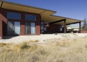
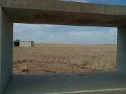
Stephanie Buhmann: Well, as an example, I am wondering about the choice of color in your work. Where does that come from? You usually work with metallics, but in a recent project entitled the Buena Vista, in Marfa, you used a rich burnt sienna. It's a very strong color, very assertive, and it seems to contrast and stand out against the surrounding grassland. Obviously, specific materials dictate some decisions, but how much do you take into account the surrounding landscape and its site-specific conditions of light and color?
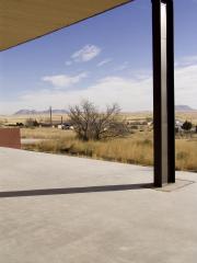
Cameron Armstrong: Observation outweighs almost everything else, especially when the site is strongly scenic. The color at Buena Vista was based on small rocks which litter the property. They're porous, iron-rich tuff, and geologically part of huge lava flows you can see in the distance. After sitting quietly with the land, their impact jumped out very strongly, and we felt there was little choice but to tie the building to them. Color-wise, the house can seem bold, but that's just because it's an unusual color for buildings per se. For most people, it doesn't take long to see the harmony between the building and the texture and color of all those little boulders. After that, we focused on the desert grasses, which were echoed in the stain of the big pine ceiling.
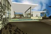
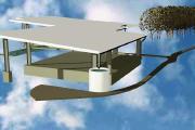
But site work isn't just for the eyes. For instance, the Buena Vista roof is twice the size of the floor plan in order to harvest rain water, for solar power, and to cover a terrace for bird watching. Because it's shaped to move breezes through the interior, it also generates fairly strong air currents that the birds have discovered are good for soaring. Our attention to the birds, and to what they care about – the wind and sky – came to be mirrored in their relations to the building (and to us). I suppose I shouldn't be surprised that designing with nature might result in it literally coming closer, but it's thrilling to see such intimacies unfold. And sometimes there's outright poetry: someone once described being on the terrace as like sheltering “under the wing of a giant bird,” the perfect metaphor.
Stephanie Buhmann: Speaking of the sky, and relations to the outdoors, how do you decide where to allow translucent surfaces, such as windows, etc., to bring in natural light that can penetrate the space?
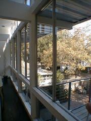
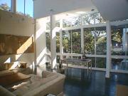
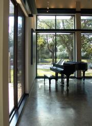
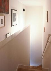
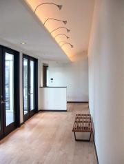
Cameron Armstrong: Light is a favorite tool, and effective. For instance, contrasting dim surfaces against distant, brighter planes is a far better way to shape space than by erecting walls, and then installing doors. It's a way of bounding functions that is essentially liberating, not controlling. The idea is for the mind to comprehend the building directly in thoughts and feelings, its own language. Using vision and other senses literally as tools brings the construction of architecture into the real time of present experience. When spaces emerge as perceptual gestures of the mind, they are much more vivid than in traditional buildings. Again, the point is to bring human purposes and experience into a situation of “zero remove” from each other. And the same applies to exterior openings. We think very carefully about how the eyes and body will move around the space and surfaces of the building. How light can be recruited for functional goals.
Stephanie Buhmann: Function and practicality have been big concerns in your work, it's interesting to talk about them in more abstract terms. How do they relate to the place you work, Texas? You have lived there for a long time, and the Texan landscape and hot climate must have had an impact. How much did these specifics determine the unique language you have developed over the years?
Cameron Armstrong: The climate, the land and the people are all mixed up in their influence. I'm mostly known in connection with the metal-sided buildings of Houston, beginning with my own house in 1993. The original idea was to be completely pragmatic. Everything about them was supposed to be based on practicality -- from their orientations, materials, and openings, to day-lighting, air circulation and proportions. Because the usual materials (like wood and masonry) actively degrade buildings in this climate by rot and corrosion, and also raise cooling costs, aluminum-coated steel was the obvious choice. We wanted durability and efficiency.
It's hard to imagine something similar happening elsewhere. When designers used high-tech metals in California during the 20's and 50's, their buildings were seen as aesthetic experiments, not new norms. But Houston is pragmatic by ideology, so my buildings were never ghetto-ized in that way. Instead, people simply took them as prototypes of what could happen "next door." Some felt quite threatened, and from their attacks you'd think we wanted to destroy something. During a filibuster in City Council, one house was dubbed the “knife in the heart” of its neighborhood. So it's much to Houston's credit that the work was so broadly accepted. Coming into an economic vacuum that had devalued many local norms – certainly including anything 'Georgian' or 'Tudor' - they caused a lot of excitement. It was contemporary architecture, not safely "experimental," and it really did come to be built next door.
Stephanie Buhmann: You take so many of your cues directly from nature, and strive to attain a balance between functionality and visual harmony. Would it be correct to say then that necessity and practicality have in a way forced you into a particular aesthetic?
Cameron Armstrong: A consistent aesthetic is probably inevitable when you start from necessity and conditions, particularly when the land and climate are as strong a presence as in Texas. But there's no need to think of the place and what it inspires as opposing eachother. If we're strong enough to deal honestly and openly with the site, be it in Texas or elsewhere, the work that results will also be strong. More than that, the work will truly and authentically become the place, and not just a response to it.
Stephanie Buhmann: Are there conditions, site-specific challenges, which you have not experienced yet and which you would like to face? In other words, are there locations or scenarios you anticipate?
Cameron Armstrong: For me, building design has broadened to become a form of site work. Practicing that way depends on a larger than usual idea of 'site,' but it's the logical extension of applying an open philosophy to working with people and the land. So, for me, the fact that Texas lacks rain forests and glaciers doesn't reduce its site-specific challenges. Each human group, and each structure brings unique challenges. As projects get larger, site relations simply become more complex. The big challenge continues to be scaling up open practice methods to handle the volume of information that results, as we've discussed.
Stephanie Buhmann: You've visited Marfa several times since I've kown you -- and on your most recent visit you sat in on a Judd writings symposium. Does the sculpture and thought of Judd figure into your work?
Cameron Armstrong: My first visits to the Transpecos were for the sake of its light and space; later, I went out there to work on several new buildings. It wasn't until the early 1990's that I paid close attention to Judd and his projects in Marfa. I hesitate to speak of affinities in the work, but there are parallels. For instance, an encounter with, say, an array of the boxes can disturb your sense of things in a basic way. Your mind is suddenly clear of preconceptions -- about the size of your feet, the height of your eyes, the color yellow -- but you feel insecure. And then you're on your own, reconstructing yourself and the object and the place, directly from your perceptions. This may or may not have been Judd's intention, but I'm happy when I'm able to create a similar process. The difference is that architecture is supposed to work its magic subtly, for the sake of durability as well as comfort, rather than through the self-consciousness of art experience. Architecture lacks a purely symbolic dimension.
Stephanie Buhmann: Even so, symbols and self-consciousness have had a role. You've mentioned to me a motivation to rescue the possibility of authentic experience, which seems a key to your work at Burcroft. Its design seems intended to create site-specific memories. In a way, Burcroft seems even to push towards establishing a kind of waking dreamscape. That's not so different from the "reconstructing" you refer to, or the way artists generate symbolic content. Can you elaborate?
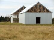
Cameron Armstrong: Practically speaking, how a place is used and representated are huge barriers to directly experiencing it. We bring an entire wagon train of assumptions to things we're familiar with. The design challenge is how to open up an awareness that goes beyond cultural baggage. Burcroft is a ranch in central Texas, in high country with views all around. To create the chance for authentic encounters there, we realized that we first had to push those expectations "over the edge," until they literally broke down. Our strategy was to support the usual unthinking associations (the shapes, materials, and siting of the buildings: the "language" of the place) and then to gently subvert them so that real awareness could emerge. The hope was to re-scale the entire landscape by liberating its images.
People coming to the ranch usually take the structures to be a familiar type of barn. But as they find differences between how the buildings look and how they function, a more critical and exploratory experience opens up. First you see a barn, and then another and another – except they seem less and less like barns. Your attention can literally start flipping back and forth between different foregrounds - the familiar one you assumed was reliable, and the new one you're discovering. There can be a sensible vibration between what you're seeing, and the visual baggage you've brought with you. Farm buildings out in the distance suddenly appear toy-like, like chess pieces strewn around. All the usual things of the farm can seem oddly estranged from their customary selves, as if part of a giant stage set. And that's the point: you see them and the surrounding landscape freshly, as if never before.
Stephanie Buhmann: It's funny how, even as you make a project that seems to be trying to "hide out" as a ranch, the buildings still look like... well, they look like something that you in particular made. No matter how keyed they are to your clients, or their sites, or even to being a place like Burcroft, your buildings in general always still seem to have signature elements -- even when pretending to be barns they exude a certain concentration of thought, an attitude towards light and materials. Could you explain the crucial design elements in your work, and how you arrived at them?
Cameron Armstrong: I'm tempted to say that with an open process, anybody would make the same buildings from the conditions we've faced. Even Burcroft, given its unusual assignment. But the reality is that the values of the owner and designer skew every decision, and so the work is bound to be idiosyncratic. And, there's the potential for endless complication as we focus on the critical needs. What I personally bring is a dedication to order and form. I want the proportions to be perfect, literally. And tools like 'symmetry,' 'axiality,' and 'rhythm' are as important to avoiding useless complications, and assuring resolution as they ever were in Palladio's day. Order and gesture are eternal questions for architects, but remember: the order we're seeking is already there, waiting to be discovered in the client and the site. The gesture we want to make is already reaching out from within their existence.
Stephanie Buhmann: Your wife Terrell James and friends, such as Virgil Grotfeldt, are painters and I know that you have many engaged conversations about this medium. How does two-dimensional work figure into your work? Do you think of lines and planes or primarily volumes?
Cameron Armstrong: Lines, planes and composition are basic tools, like light. But what I most share with the artists is an interest in how the work is made, and how it produces experience. Because every new thing they make can sometimes seem also to require whole new ways of seeing, it can be as if they constantly rediscover vision itself. I want my buildings to sponsor rediscoveries too, though in broader terms. So, we often talk about how one thing comes from another, how to handle accidents of perception, and how to navigate when the work gets beyond what we can easily judge or recognize. Since my clients' purposes are often at first only vaguely understood, by them and by me, I'm frequently in unfamiliar territory. I've learned from the artists how to be comfortable there, how to work beyond preconceptions.
Stephanie Buhmann: When we began our conversation, you mentioned that in the past you had especially studied Adolf Loos’ thought. In fact you said that in some ways you “trace your work back to him.” Not unlike Loos, you seem to follow a philosophy that focuses on pure forms for economy and effectiveness. In addition, Rudolf Schindler has been of importance to your work. Can you go into detail? Are there still parallels?
Cameron Armstrong: Adolf Loos has been very important to me. Specifically, the strategies of his famous “Raumplans,” as well as how they were later developed by his student Schindler. Loos' generation was the first to see how personal symbologies are performed in architecture. But it was his insistence on the specifics of client needs, and the implicit voices of his rooms themselves that most inspired me. Early in my career, I tried to design exactly in his image; later, I saw my work extend into Schindler's more overtly psychological territory, as if in a natural progression. In a sense, I feel that I worked through their relationship, and then extended their ideas into engagements with my own time.
Stephanie Buhmann: We also briefly shared some thoughts on the work of Frederick Kiesler, who played with the fine divide between architecture and sculpture. In fact his quote was that “all good architecture was also sculpture.” What are your thoughts?
Cameron Armstrong: My interest in Frederick Kiesler was at first related to his collaboration with Loos. The reasons for their mutual attraction are obvious, but it's not surprising they didn't work together for long. I think that Loos was forever motivated by a need to create paradigms of harmony. He wanted his clients to experience the civilizing effects of truly bespoke conditions, and find social and psychological balance through them. A classical notion of the potential for a “perfect fit” between people and buildings underlaid his entire career, both in private work and in social housing. Kiesler also sought an ultimate harmony through architecture, but for him buildings were a backdrop, not a normative force. For him, the final harmony would be realized in experience, by personal improvisation. In his world, one could rearrange existence as it evolved, without a designer's ambition to structure or represent it. And that's the open frame he proposed with his Endless House. The best of Loos' buildings were highly specific, in absolute correspondence to their clients' particulars, while Kiesler's vision was of open, non-specific armatures. If Loos' Purism offered an image of timeless, classical order, Kiesler's project epitomized the radical openness of the Jazz Age.
Stephanie Buhmann: I think this idea of an architect responding with his work to a sentiment of his time is fascinating. If Kiesler’s work was reflective and ingrained in the freedom of the Jazz Age, for example, how are your thoughts on your time, the age of new information technology?
Cameron Armstrong: The world is becoming virtualized very quickly. Due to the power of the new digital technologies, it seems that ideas and tools aren't to be different things anymore, but are literally becoming each other. The operational sequences linking beginnings to ends, from selecting material all the way through their making and use – and whether it's a toothbrush or a church – have always been tied to intangible dimensions of mental life. But thinking has now become doing, literally. This kind of instrumentality is leading quantitative thinking deeply into realms of feeling and intuition, but we're also finding 'facts' to be inherently contaminated by 'qualities,' whether in physics or law. And there's also the question of scale. For example, big music pieces can now be modeled in a computer, just like big engineering projects. With decisions large and small so easily accessible to accurate modeling, people are becoming accustomed to controlling the decisions affecting their lives. The built environment has always been, partly, a kind of lucid dream. Where we take this dreaming now is anybody's guess, and opportunity. Everything is up for questioning, and anyone's answer could be valid, so we see the world flattening out and opening in a big big way. For architects, the task is to invent better ways to make this expanded space an authentic reality. A place that is as big as the people in it, rather than one that limits and stunts them. Although I can't yet imagine inhabiting a true "endless space," our movement towards improvising architecture in real time is bringing Kiesler's vision closer and closer to reality.
